increase in credit card payments in the first year
BBVA Mexico · Credit
Revolving Credit
Interest Simulator
Designing for a local customer need: helping people in Mexico understand the consequences of each credit-card payment.
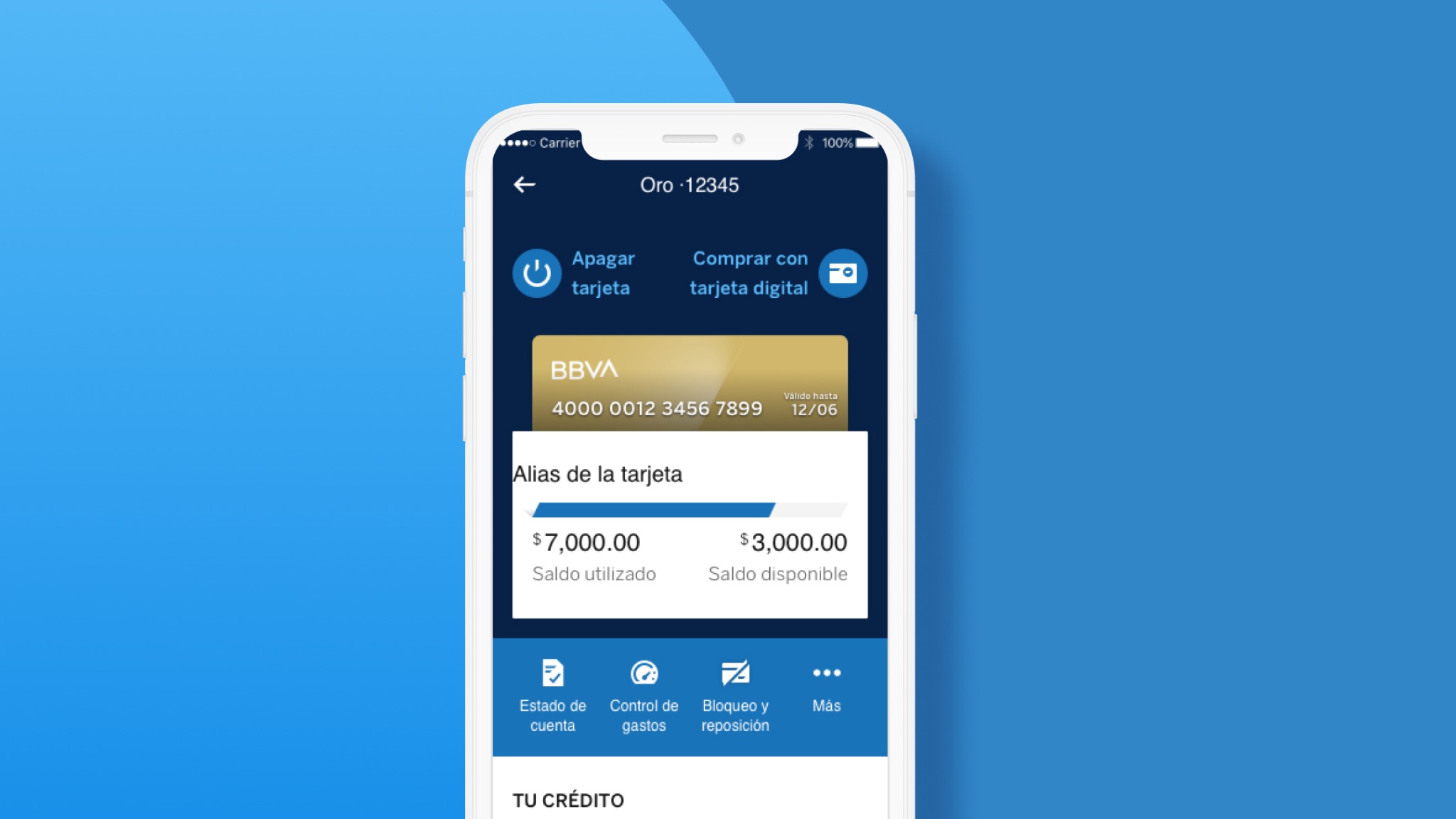
Impact & context
active BBVA Mexico users at the time—the market context, not simulator adoption
to ideate, prototype and test in a design sprint
01Context
A local need outside the global playbook.
BBVA Mexico had more than nine million active users making monthly credit decisions, yet no decision support at the point of payment. The global team in Spain had deprioritized the opportunity. We used research with Mexican customers to make the case for a local priority: helping people understand the consequences of a payment before committing to it.
Orange was a new credit-products business line intended to help customers access and control credit products around their payment capacity. The ambition was a connected digital experience that helped customers understand and use the financial opportunities available to them.
02Research
Understand the decision before designing the tool.
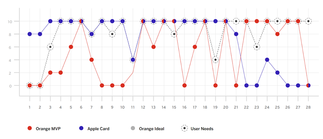
We used a strategic canvas to compare the value of Apple Card capabilities with the existing BBVA experience. An effort–value matrix helped prioritize opportunities for the programme.
My user research focused on how customers understood credit-card interest at the moment of payment. Three questions shaped the design: how to explain and visually distinguish interest; where users looked for that information; and what deserved priority during payment.
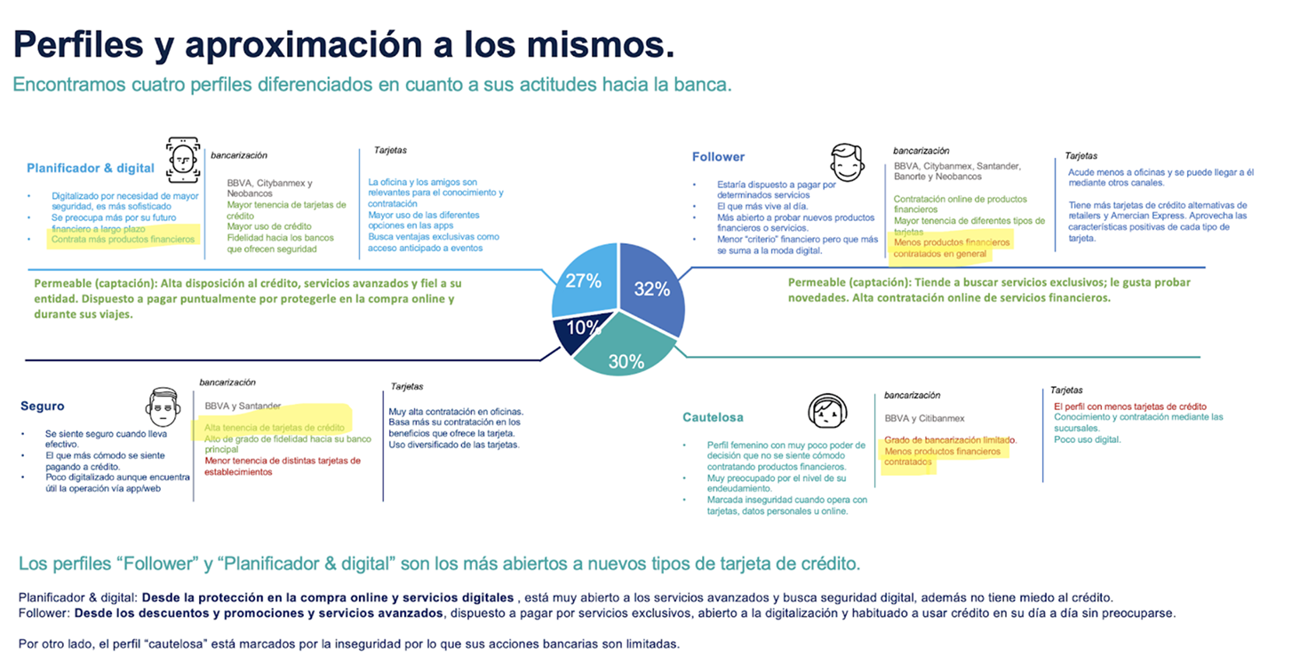
The analysis identified two broad profiles, independent of financial segment, and four archetypes based on financial behaviour and credit-card use.
What research changed in the design
Explain the estimate
Research showed that customers could interpret an interest figure as a promise. Because revolving interest could vary, I paired approximate figures with plain-language explanations of what each payment meant for their balance and available credit.
Put guidance where the decision happens
The research focused on comprehension at the moment of payment. I embedded the simulator in the existing BBVA payment flow so customers could compare choices alongside the information they needed to complete the task.
Support exploration and a known amount
Testing showed that some customers already knew how much they wanted to pay. I added direct amount entry alongside the slider: one supported exploration, the other a specific intention. Both exposed the consequences before confirmation.
04Ideation
One week to explore. Three months to release.
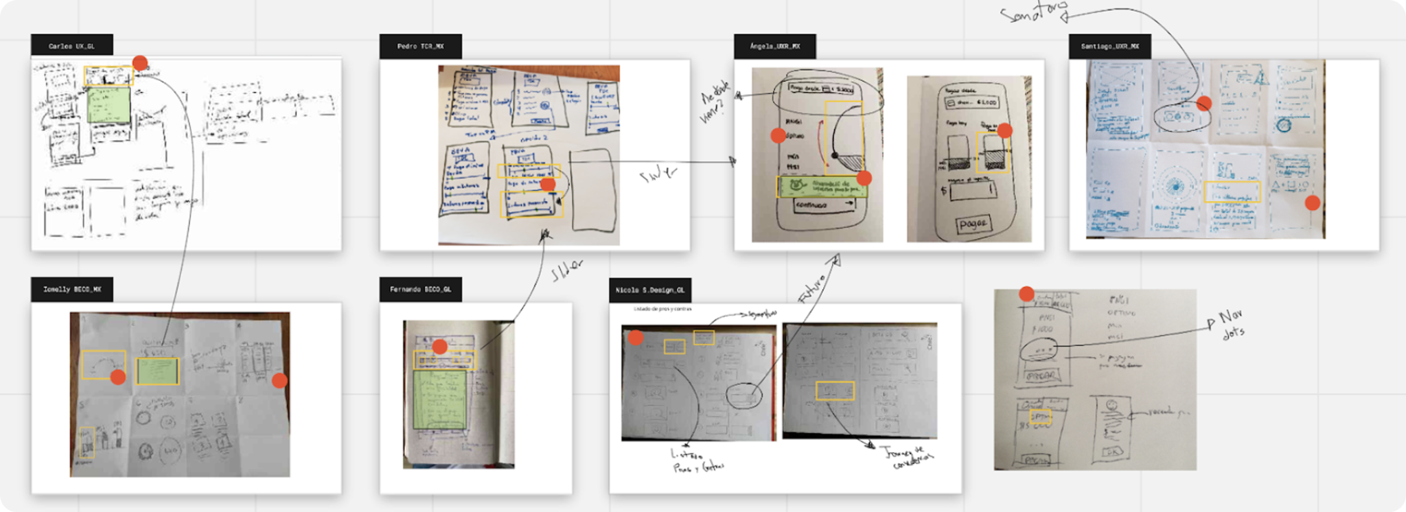
With a three-month time-to-market target for Orange, I facilitated a one-week design sprint to ideate, decide, prototype and test with stakeholders and customers.
We brought together payment and usage metrics, call-centre issues, qualitative research, personas and archetypes. My team and I proposed a scenario simulator that would make the consequences of different payment choices visible, helping users consider those choices alongside their available money.
05Prototyping & testing
Test comprehension across the whole payment flow.
I created a prototype within the look and feel of the BBVA app and tested it with real users. The evaluation covered understanding, usefulness, navigation and usability—from entering the app to choosing a payment.
We checked whether users understood their selected payment option and its effect on interest in the next period. These findings informed the content and its placement.
We also explored whether the experience created a sense of certainty, evaluated the multi-step navigation and identified components that needed refinement.
06The solution
Show consequences instead of false precision.
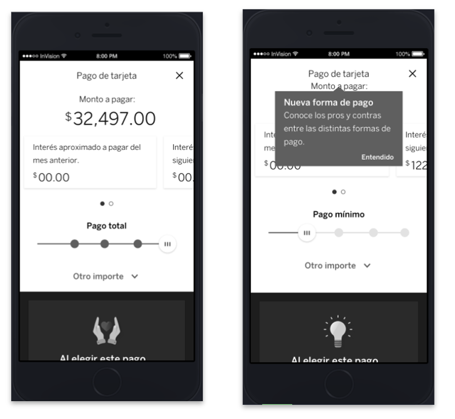
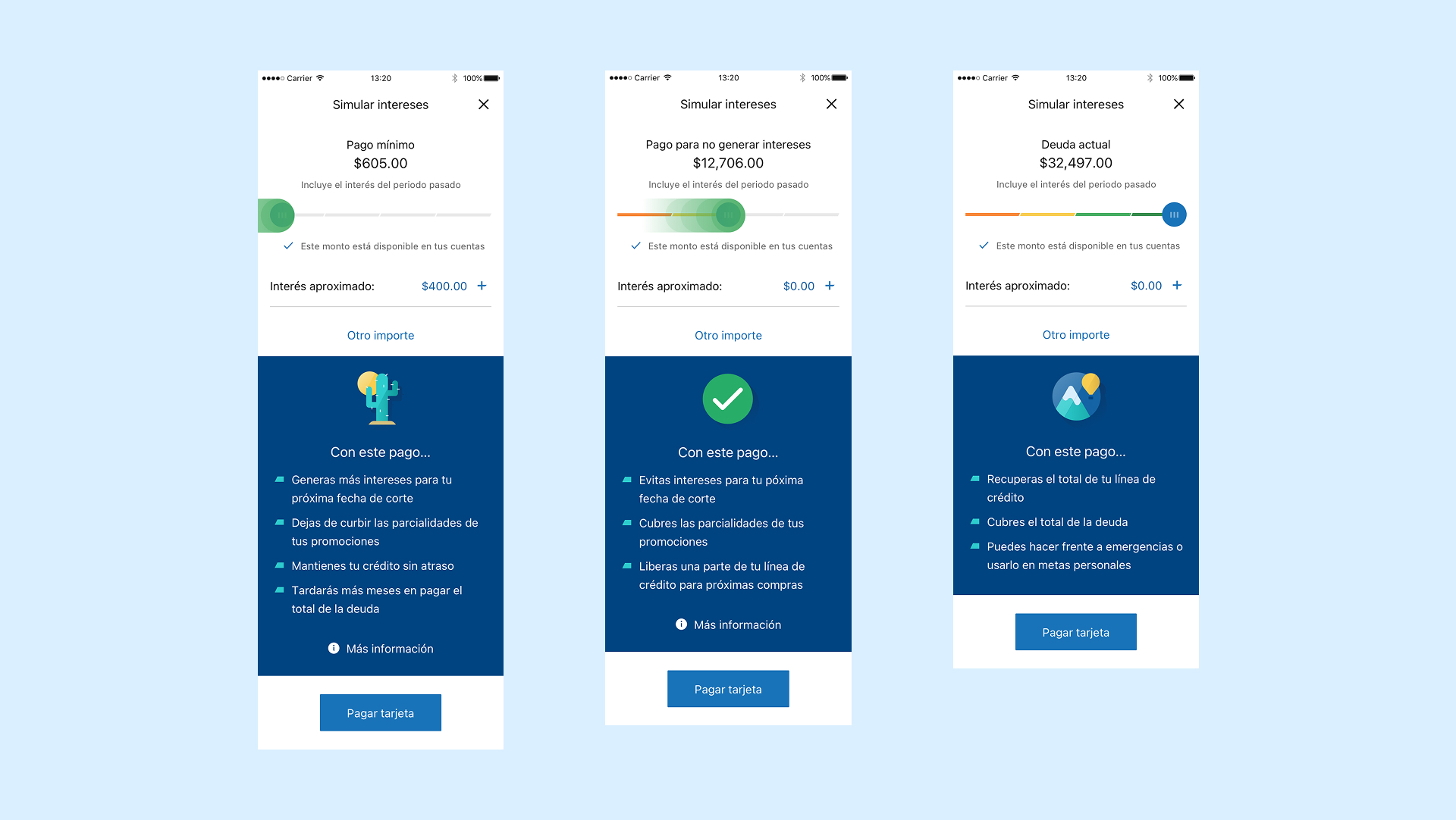
Because revolving interest could vary, I paired approximate interest figures with plain-language explanations of each payment’s consequences. Customers could see the estimate alongside what their choice meant for their debt and available credit. The simulator helped them understand how unpaid balances could accumulate interest and increase their debt, supporting more informed payment decisions.
Embedded in the BBVA payment flow, the simulator let users explore outcomes in real time. A slider moved from minimum to full repayment, updating a consequence card with the impact on their balance and credit line.
07A consequential iteration
The slider was not enough.
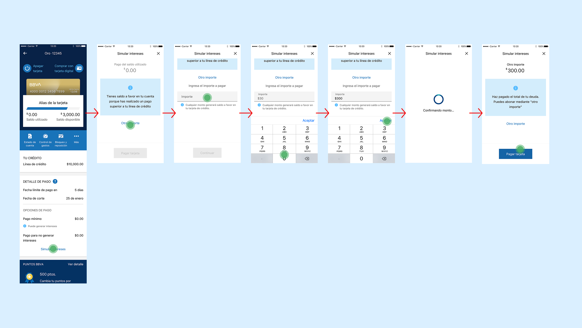
We assumed the slider would serve everyone. Testing showed that many customers already knew how much they wanted to pay. For them, exploring with a slider added friction.
Testing led me to add an input field behind “Otro importe” so customers could manually enter what they wanted or could afford to pay and see its impact. The slider supported exploration; the input field supported a specific amount. Both led to the same explanation of consequences.
08Learnings
What I learnt
A shared product roadmap did not remove the need to understand Mexican customers’ payment decisions. Research helped us advocate for a local opportunity, while designing the solution within the existing BBVA app.
Variable interest meant that an estimate could not be treated as a guaranteed total. That constraint pushed me to pair approximate figures with clear explanations of payment consequences, helping customers interpret the numbers rather than relying on them alone.
The Cautious user and the Digital Planner needed completely different entry points. Designing only for one would have failed the other. The slider served explorers. The input field served those who already knew. The best decision-support tools make room for both.